

Previous posts:
Day One: Setting Up Google Analytics
Day Two: Visitors Overview
Day Three: Audience
Welcome back to my series on Google Analytics for bloggers! Today we’ll be taking a look at some other screens and widgets that you will hopefully find helpful.
On the left hand sidebar, you’ll see the heading “Traffic Sources.” Under that heading, click on “Overview.”

This screen will show you your daily visits at the top, as many screens do. As you scroll down, you’ll see a pie chart:

This chart breaks down the visits to your site by how your readers got there. Search traffic is people who got there by a Google (or other provider) search, referral traffic is people coming from another website that linked to yours, and direct traffic is when someone types your URL directly into their browser. You may or may not see “campaigns” on your chart, but all my visits coming from Feedburner show up there on my chart.
Now, you probably want a little more information about your traffic sources, so click on Traffic Sources – Sources – Referrals:

The timeline at the top will show you the number of daily visits you had that came through a referral. Scroll down and you will see a list of your referral sites, in order of which ones are bringing you the most traffic:
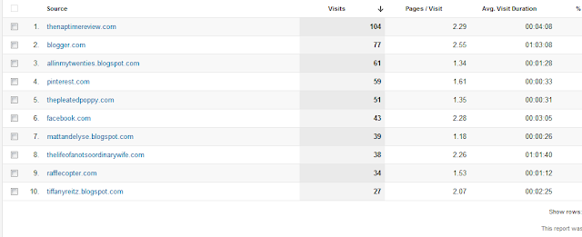
This is really useful information. You can see from this list which sites are bringing you good traffic, and how engaged those readers are once they come to your site (how many pages they visit, how long they stay, etc). This can help you know which sponsorships are paying off, or which link-ups are bringing people to your site. This is one widget that I like to have on my home page, which we’ll talk more about tomorrow.
Now go to Traffic Sources – Sources – Search – Organic.

The timeline on this page will show you how many of your daily visits came through a search, such as Google. Scroll down, and you will see a chart of the keywords and phrases people searched for that brought them to your site:

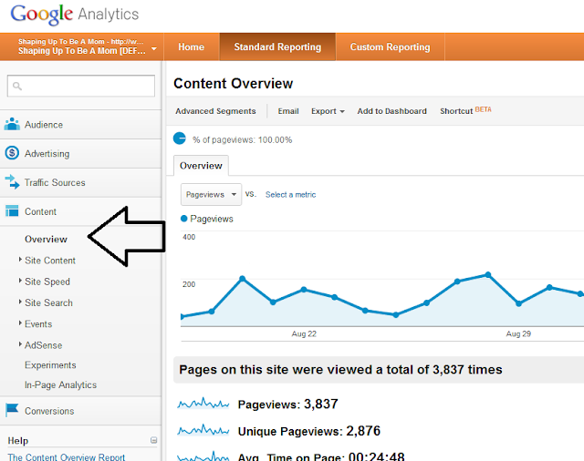
Now we are going to look at a few screens under the “Content” heading, the first of which is Content – Overview:
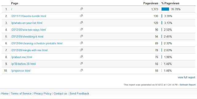
The timeline at the top of this screen will show you your daily pageviews. Remember, this is different from “visits” because a pageview is counted every time someone loads a page of your blog. Visits are counted from the time someone comes to your blog to the time they leave, whether they view one page or twenty.
Scroll down the page to find a list of your most-viewed pages/posts, in order of how many times they were viewed. This is good information, because it shows you what people are reading, and what visitors to your site are most interested in.
And the last two screens we are going to look at today are under Content – Site Content. We’ll look at “Landing Pages” and “Exit Pages.”
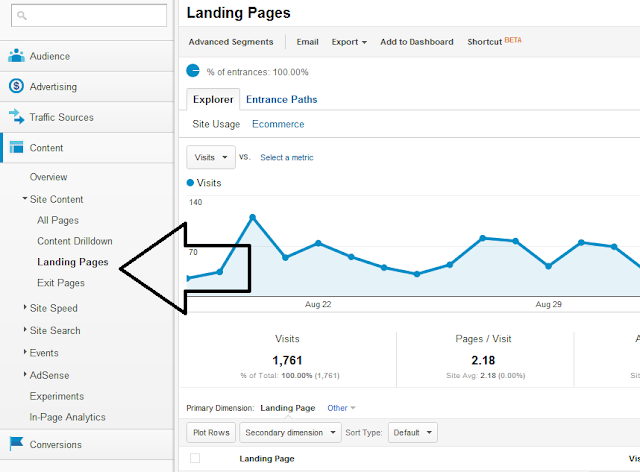
These two screens are very similar. Landing Pages shows a list of the pages that people came to first when visiting your blog, and Exit Pages shows the pages that people left from. It also includes the number of landings on or exits from that page, as well as that page’s pageviews.

Remember that these numbers are by default always from the past month, but you can change the dates in the upper right of the page, to look at numbers in any date range you choose.
You may have noticed by now that a lot of the screens in GA give you similar or repetitive information. That is why you are given the option to customize a home page or dashboard with the information that you feel is the most important to you. Tomorrow I’ll be showing you how to do just that, so see you then!
Thanks for reading, and feel free to share!
